First of all, thank you all so, so much for reading and sharing my post earlier this week on ways to make your kids feel crazy loved! I really (like, really!) appreciate all of you who commented or shared or pinned…And a big welcome to any new visitors because of that piece! I’m thrilled that you’re here.
As for today, it’s been too long since I shook it up around here with some design talk! I thought I’d point you to some of my favorite designs posts from around the internet—because sometimes on a Friday, we all just need a little distraction. 🙂
1. Did you see John and Sherry’s show house? (above) Sherry said they were aiming for “happy, fresh, and comfortable,” and I think they nailed it. I would move right in. It makes me think pops of coral, green, and sea blue are the answer to everything.
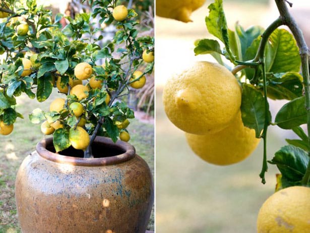
2. As an apartment dweller, I was sold on this idea of growing a lemon tree in a container. It’d be like bringing a piece of the Italian coastline to my patio. Of note: apparently the kind of pot you buy matters.
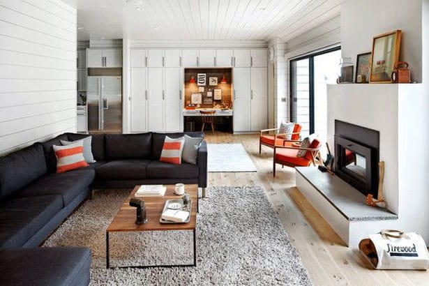
3. The home of the creators of Schoolhouse Electric is definitely worth a peek. I love how cohesive it is from outside, in.
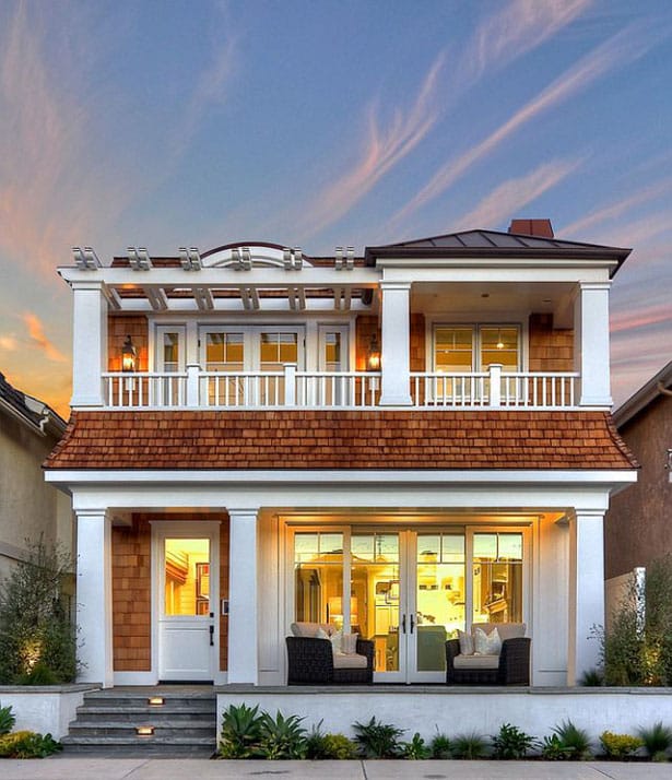
4. Tell me you’re not dying over the exterior of this California beach house. I could stare at it all day. The only thing better would be actually living in it. 🙂
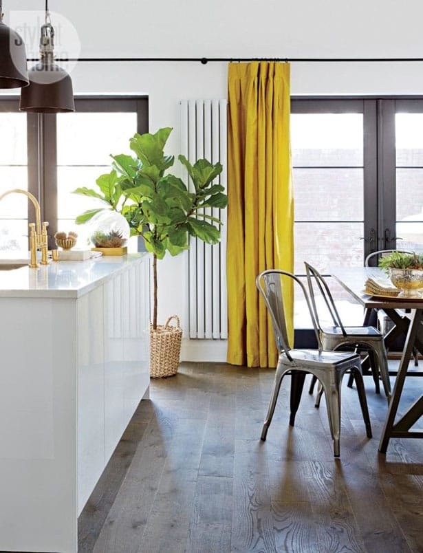
5. This kitchen and dining area caught my eye. I love that happy punch of color in the yellow silk drapery, and I was intrigued by the use of gray upper cabinets with white lowers, the herringbone gray backsplash, and the black light fixtures. It’s bolder than I would probably go in my own home, but I feel like just looking at it challenges me to take a few more risks in my (hypothetical) decorating. 🙂
Visit Erica Layne | Let Why Lead’s profile on Pinterest.
Happy Friday, sweet friends!




I love the looks of these pictures. I could go and relax here very easily.
Beautiful!